
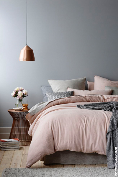
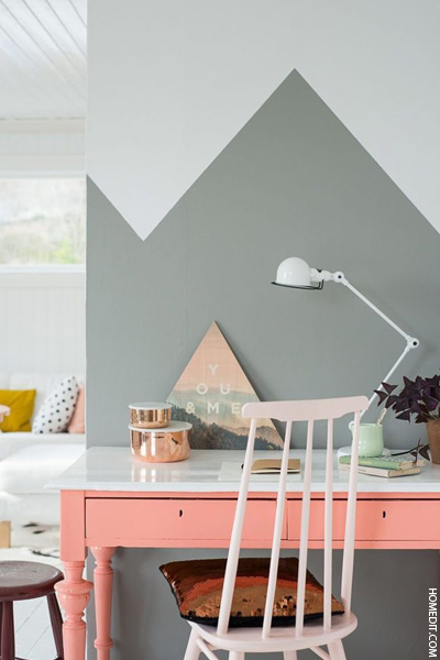
A spot-on mix of
feminine-meets-industrial, we’ve fallen tresses over toes for grey/pink
interior mix-ups of late. And it seems the style set are with us, as is
evident from the plentiful stream of Pinterest images showcasing the
trend.
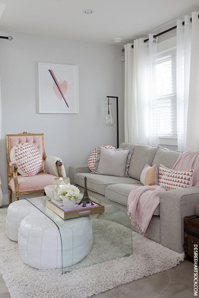
Whether you use the
complementary shades to refresh your walls, update your soft-furnishings
or as part of final flourishes - think cushions, artwork, vases and
lampshades (a touch of copper doesn’t go amiss here, either) - this is
one interiors trend that epitomises laidback cool.


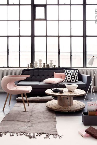
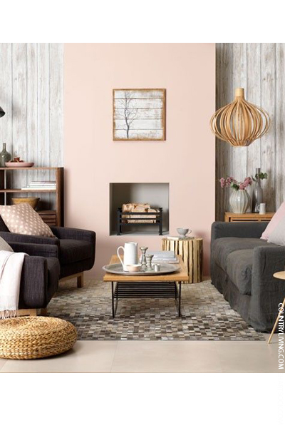
Before recreating the look for yourself, check out these top tips from SL’s Interiors Panel experts Nicole Salvesen of Salvesen Graham and Natalia Miyar of Helen Green Design:
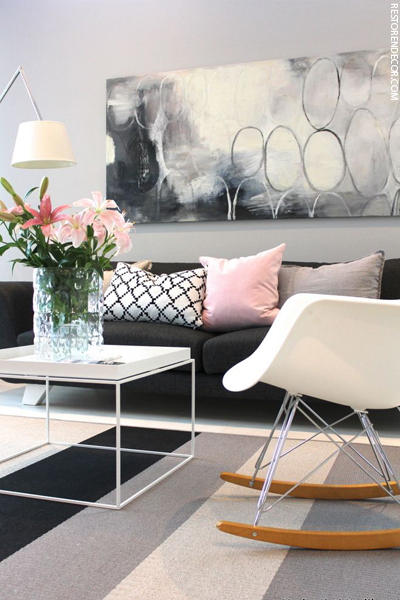
"To stop things looking too girly, avoid bubblegum tones like peach
pink or raspberry. Farrow and Ball is your best option - try Setting
Plaster, Dead Salmon and Dimity - or the brand Little Greene (we love
their Light Peachblossom shade). Don't be afraid to use different tones
of pink in the same room, and remember that layering pink-toned patterns
can also look really effective," says Nicole.


"I like to use rose gold or copper detailing on furniture, as this
looks especially glamorous in contrast to grey timbers. When it comes to
walls, duskier tones of pink are a more understated and subtle choice.
Look for warmer tones like Plaster II from Paint Library," says
Natalia.


Credits: http://sheerluxe.com
No comments:
Post a Comment